Duration: 1 and ½ hours
Introduction: It has become remarkably simple to create a valid-looking website, which to the unassuming eye resembles an official, big-name news outlet. But as if verifying text content wasn’t hard enough, seductive visualisations; graphs, charts, and maps, made with free tools found anywhere on the internet, can make fact checking even harder.
In an increasingly data-saturated world, individuals without the necessary skills to interpret the visualisation of that data with a critical eye are at a disadvantage. Indeed, while there is no shortage of disinformation and “FAKE NEWS!” around, there is also estimated to be a deficit of 500,000 data scientists and statisticians in the EU, meaning plenty of opportunities for anyone with a head start in data literacy.
The ability to collect, manage, evaluate, and apply data, in a critical manner, can begin in the classroom by showing young people exactly how statistics and numbers can be doctored by anyone with a particular agenda in mind. The following selection of skewed or outright false data visualisations are all examples of how, to paraphrase Gregg Easterbrook, if you torture numbers, they’ll confess to anything. Below these you will find some links to resources for teaching and further reading.
A) Interrogating numbers
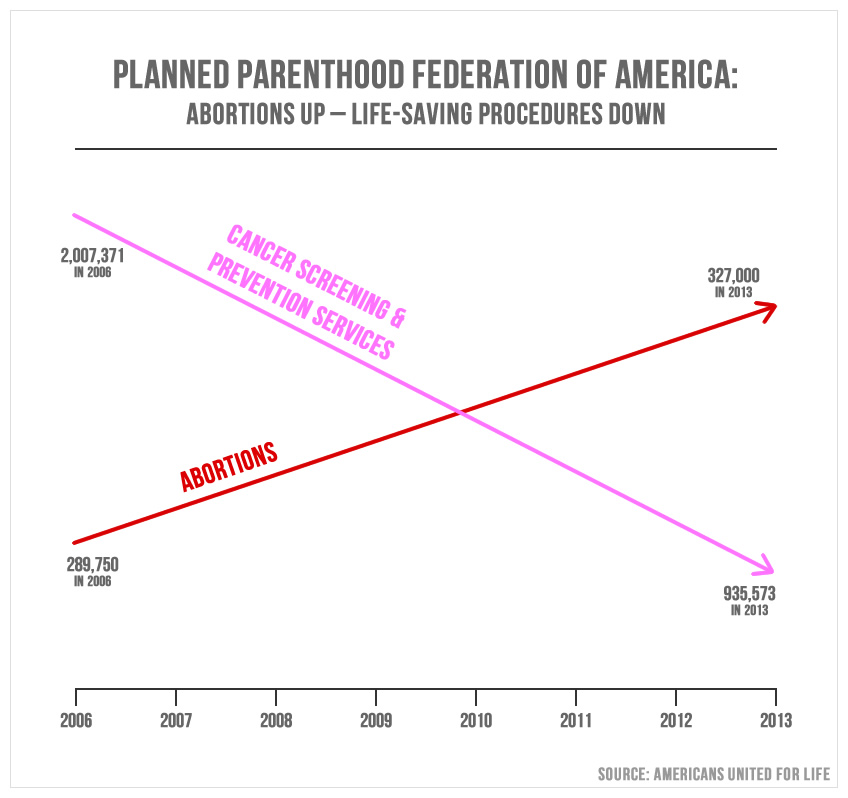
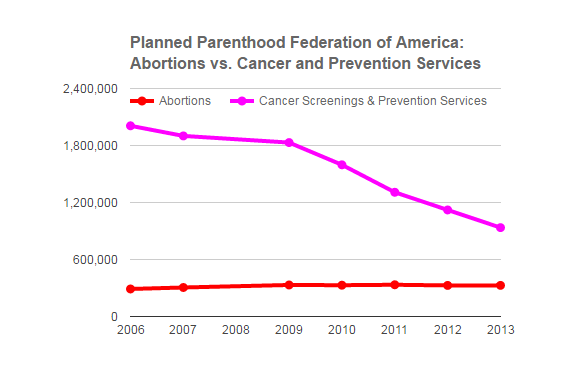
- Below is a graph showing a rise in abortions and decrease in cancer screenings at the US planned parenthood federation. It was used in a presentation by a politician as evidence to show why Planned Parenthood should be de-funded. However, a close look at the graph shows the scale is skewed. The correct graph is below.
- Ask students if they can see anything wrong with the graph. If no one can see anything then probe; where is the scale? What do the numbers say and how high/low are they represented on the scale?
- Ask students to perform a reverse image search on the graph to find out who made it and what their motivation was? Ask them to see if they can find the real graph in their results.
HINT: The 5 key questions and concepts can be a useful tool here.
B) Correlation ≠ Causation
- Ask students what they think the term “correlation does not equal causation” means?
- Show them the graph below and explain that often when an individual or organisation wants something to be true, they use correlation to prove their point. However, as we can see from the below graph, corresponding statistics do not necessarily relate to each other.
- Ask students if they can find other examples online of correlation and to decide whether these correlations are useful or just coincidence.

C) Search online
- Ask students to do a search online to look for more dodgy statistics.
- Use search terms like; dodgy stats/statistics, misrepresented data/study/report, data/statistical literacy, skewed graph, biased study etc…
- Once students have found their dodgy data they should write a report following the 5 key questions and concepts.
- To dig further, they should try to look for flaws or bias in how the data was gathered
For more resources check out EAVI’s Data Literacy Primer
Duration: 1 and ½ hours
Introduction: It has become remarkably simple to create a valid-looking website, which to the unassuming eye resembles an official, big-name news outlet. But as if verifying text content wasn’t hard enough, seductive visualisations; graphs, charts, and maps, made with free tools found anywhere on the internet, can make fact checking even harder.
In an increasingly data-saturated world, individuals without the necessary skills to interpret the visualisation of that data with a critical eye are at a disadvantage. Indeed, while there is no shortage of disinformation and “FAKE NEWS!” around, there is also estimated to be a deficit of 500,000 data scientists and statisticians in the EU, meaning plenty of opportunities for anyone with a head start in data literacy.
The ability to collect, manage, evaluate, and apply data, in a critical manner, can begin in the classroom by showing young people exactly how statistics and numbers can be doctored by anyone with a particular agenda in mind. The following selection of skewed or outright false data visualisations are all examples of how, to paraphrase Gregg Easterbrook, if you torture numbers, they’ll confess to anything. Below these you will find some links to resources for teaching and further reading.
A) Interrogating numbers
- Below is a graph showing a rise in abortions and decrease in cancer screenings at the US planned parenthood federation. It was used in a presentation by a politician as evidence to show why Planned Parenthood should be de-funded. However, a close look at the graph shows the scale is skewed. The correct graph is below.
- Ask students if they can see anything wrong with the graph. If no one can see anything then probe; where is the scale? What do the numbers say and how high/low are they represented on the scale?
- Ask students to perform a reverse image search on the graph to find out who made it and what their motivation was? Ask them to see if they can find the real graph in their results.
HINT: The 5 key questions and concepts can be a useful tool here.
B) Correlation ≠ Causation
- Ask students what they think the term “correlation does not equal causation” means?
- Show them the graph below and explain that often when an individual or organisation wants something to be true, they use correlation to prove their point. However, as we can see from the below graph, corresponding statistics do not necessarily relate to each other.
- Ask students if they can find other examples online of correlation and to decide whether these correlations are useful or just coincidence.
C) Search online
- Ask students to do a search online to look for more dodgy statistics.
- Use search terms like; dodgy stats/statistics, misrepresented data/study/report, data/statistical literacy, skewed graph, biased study etc…
- Once students have found their dodgy data they should write a report following the 5 key questions and concepts.
- To dig further, they should try to look for flaws or bias in how the data was gathered
For more resources check out EAVI’s Data Literacy Primer